I got a PHE fellowship to come and visit Bill Hanage at the Harvard School of Public Health. While I was going to rely on my English accent to convince everyone I’m intelligent, half the people in the group are English so I thought I better do some work.
One of the English expats is Nick Croucher who has done lots of lovely work on Strep pneumo. In his recent Nature Genetics paper he did a plot (fig 7) showing, for an increasing threshold of SNP distance, what proportion of pairwise comparisons that had at most that number of SNPs between them were from the same geographical area. If that gave you a headache, hopefully will be a bit clearer by the end. Bill suggested that these plots might be a nice way of looking at our data and he was right!
First things first, the major requirement of this plot is that you have the SNP distance between all the pairs of isolates in your dataset. Tim Dallman handled that part, if that is a major stumbling block for people then leave a comment and I might learn/go-into more detail on that.
Once you have your pairwise comparisons, you need to classify each pairwise comparison (pwc) based on the two isolates in the pwc. In our example the classifier is ‘are they the same phage type’. I did this classification with python, quite straightforward. Then, sort and separate on your classifier so you have something like this…
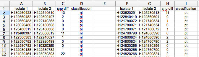
pt = same phage type, nl = not linked
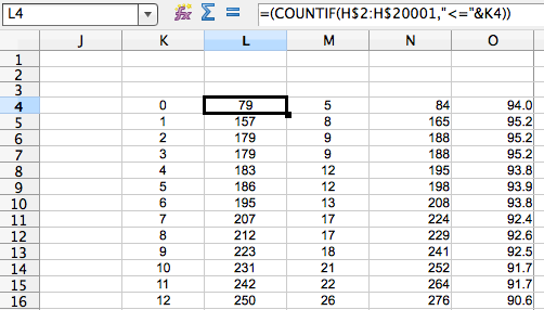
Then, a little excel-fu. Best illustrated by another cmd+shift+4 (the mac’s killer app imho). If you look at the image below, K is a range of how many SNPs you want to go up to. L is a count of how many cells in column H (the ‘phage type’ column, see figure above) are less than or equal to that particular SNP threshold (in K) (also, this is Libre Office, syntax might be different in excel). M is the same for the ‘not linked’ pwcs. N is the sum of L and M i.e. the total number of pwcs that are that many SNPs apart. O is the percentage of pairwise comparisons that have at most that (K) many SNPs that are the same phage type.
Plot O by K and you got yourself a stew going!
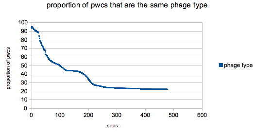
The changes in the slope in the plot reflect the structure the the tree – the bump at around 150/170 SNPs is a sudden spate of new ‘pt’ pwcs (compared with the ever increasing number of ‘nl’ comparisons which gives the plot a general downward trajectory) on very different parts of the tree.
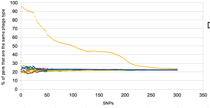
The last thing is the random permutations. I’m not going to bore you with the details of this, see this script for details/how to do it. Turned out to be a bit of a pain in the posterior and that script is rather clunky, anyone know a better method, please let me know. The script takes a csv file with two columns, one for snp distance and the other for classification and prints 9 random permutations which allows you to plot something like…
Any probs/questions get in touch. It really all falls into place when you do it yourself, so give it a go!


