Another thing I have learned to do while at HSPH is to make maps with a nice sprinkling of visual sugar e.g. proportional point sizes, different colours, different shapes. This post will take you through that. Thanks to Amy Wesolowski at HSPH for teaching me how to do this! The commands below can also be downloaded as an R script to run in e.g. RStudio.
First, you need to install three R packages – maptools, maps and mapdata (you might not use all these in this example but all useful).
Then you need an input file – the two variables I want to represent on my map (in addition to location) are the MLVA cluster of the isolate (represented by colour) and how many isolates clustered in the same location (represented by size of point). Therefore, the input csv file looks like this…
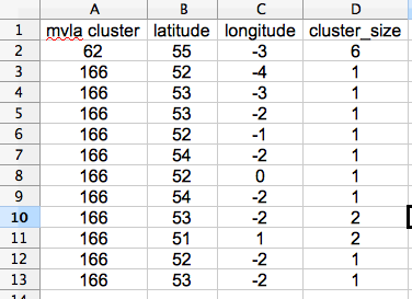
The ‘cluster size’ relates to how many isolates came from that geographic location rather than how many isolates were in that MLVA cluster. Lat and long have been rounded for PPI reasons – in your data, there should be no identical lat and long combinations, if there are, then you combine them into one line and sum the cluster sizes.
data = read.table(‘/path/to/input.csv’, sep = ‘,’, header = TRUE)
Then you define a vector (col.vec) where each entry in the vector is a colour from ‘rainbow’, the length of the vector is defined by the number of different MLVA clusters
col.vec = rainbow(max(data$mvla.cluster))
Then, we make two vectors that will determine the shape and size of each of our points (like most code, hopefully this makes sense once you read through the whole code).
size.vec = c(0.7, 1, 1.5, 2, 2.5, 3, 3.5)
shape.vec = c(0,2,5,3,8,6) # we don’t really use this here.
Then, we draw the map that we are going to plot our points onto. This is the meat of the map sandwich we are making – it takes advantage of a ‘shape file’ library in R. A shape file is a map with the longitude/latitude data underpinning it – if anyone has an R compatible shape file of just the UK that would make the figures a bit better, quite small currently.
map(‘worldHires’, c(‘UK’), xlim=c(-6,2), ylim=c(50,55))
Now we just plot the points in ‘data’ onto the map defined above. The colour and point size (cex) are detemined by the col and size vectors as the key. R is being really neat here and just iterates through the vectors when it encounters a new value in the mlva.cluster or cluster_size columns.
points(data$longitude, data$latitude, col = col.vec[data$mvla.cluster], pch = shape.vec[data$time_cluster], cex = size.vec[data$cluster_size])

You could also change the shape of the point to illustrate e.g. clustering in time, by adding another column in the input file. This is the case in the R script. Once again I’m dazzled by what can be achieved by a few lines of R, once you know the right lines!


