I saw this amazing ‘natures-heartbeat‘ cartogram, and thought it would be cool to have something similar for TB incdience. There doesn’t seem to be any TB cartograms already available, so I thought I would make my own.
I used the cartogram package in R. After spending some time in the deeper circles of R dependecy hell this blog helped me get it working. I got the TB stats from WHO. I’m using the ‘Estimated number of incident cases (all forms)’ measure from the WHO. They have 2000 to 2016, ideally I would make a cartogram for each year, and then string them together into a GIF to show the changes, but that would involve synchronising the scaling over the different years, which I don’t know how to do.
If you are using the cartogram R package, then be aware that it doesn’t handle 0s in your data well (it runs, but there is no distortion of the map), which is why there is a +1 to all the TB cases in the below gist. It’s the only time in my experience that having 0 TB cases in a country was a bad thing!
Anyway, here is the code.
And here is the cartogram:
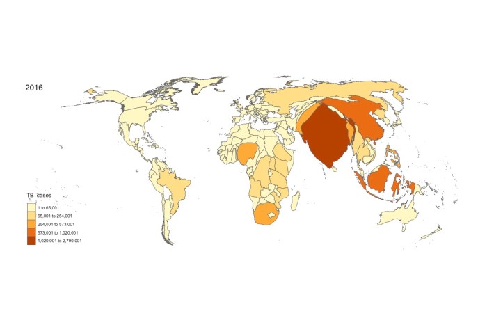
Released under a CC-BY license, and here is a link to an SVG version.


